Steph Nardi Photography
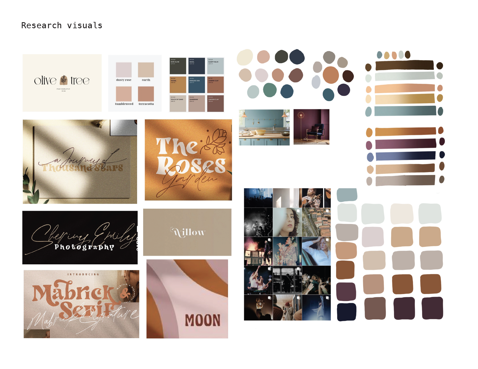
I had the honor of helping my friend, Steph, rebrand her photography business. She wanted her brand to feel warm, authentic and empowering with a retro and vintage style. Since her field requires networking and various platforms, we felt she needed a suite of items to be able to use in any given situation.
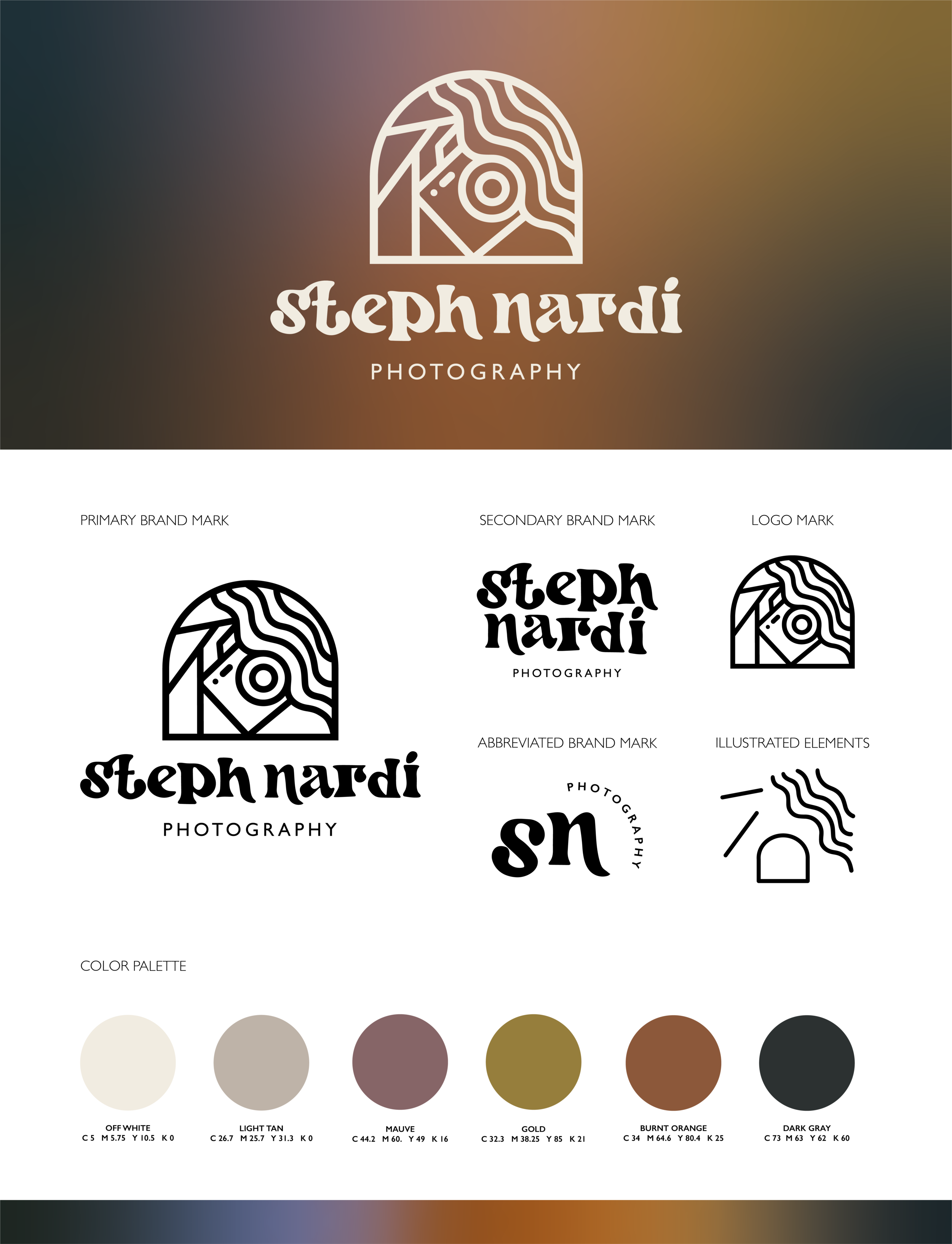
The brand mark is set in an arch to provide structure and depth to the design. An archway is something you look and move through and that parallels nicely with the idea of photography. Within the arch, the aperture angles and Steph’s curly hair frame her camera to imply she is looking through her lens at you. All the continuous lines allow the eye to move throughout the design without interruption.
The primary font is Mabrick from Dirtyline Studio. Steph was a huge help in researching what font reflected her style. We decided on Mabrick because the curves and flow of its design were reflected in the brand mark we chose. The secondary font is Gill Sans to provide simplicity and round shapes to contrast but also subtly align with the grooviness of Mabrick and the brand mark.

The color palette was taken from colors seen in her photography to compliment and create an inviting aura. The range is all muted tones to allow each photo’s light and color to stand out.