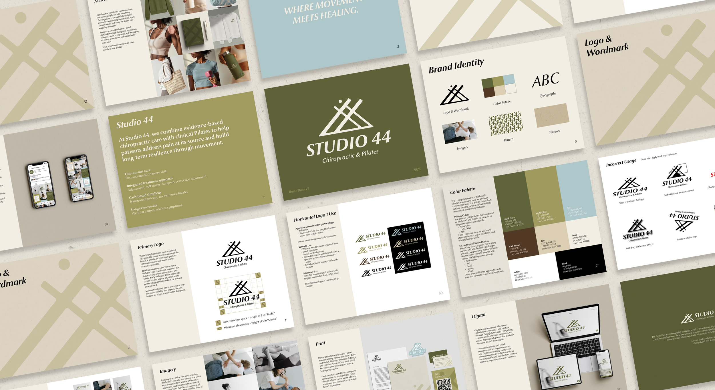
Dr. Emily envisioned a brand that feels grounded, centered, earthy, and clean. The visual identity reflects these qualities through a refined sans serif typeface with subtle organic characteristics, balancing professionalism with warmth. The custom symbol is derived from the "44," using matching line weights to create a cohesive system that embodies movement, alignment, and connection. Together, the typography and mark communicate a sense of balance while reinforcing the practice's holistic approach to chiropractic care and Pilates.