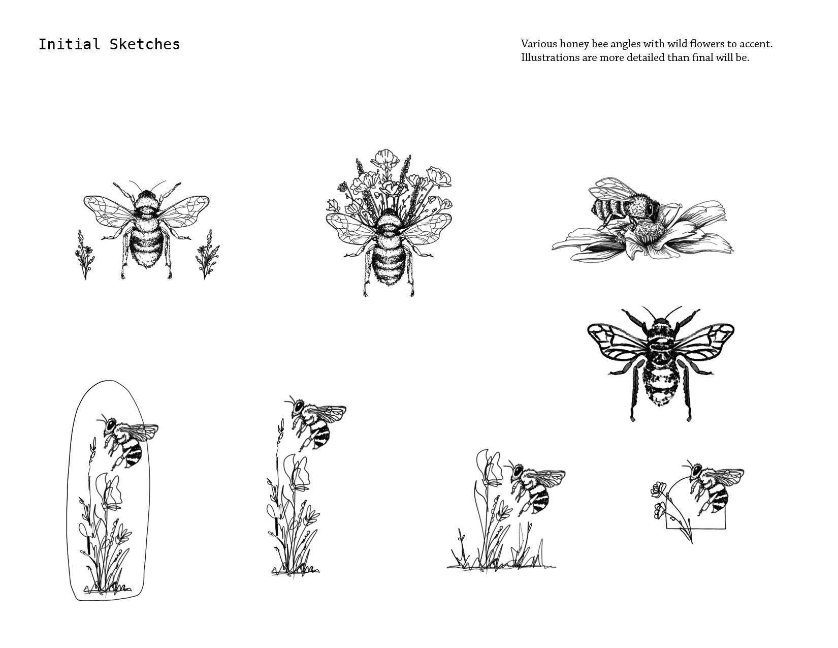
honey bee brand house
A coworker and his wife, Mike and Tamara, asked me to create a brand mark for her freelance consulting business. Her brand aesthetic was personal, authentic, organic, and unique and her accompanying style keywords were delicate, organic, and hand drawn. We started with more complex bee and flower drawings until ending up with a simple yet fluid flower/insect/bee mark. The additional flower replacing the “o” in Honey ties in the brand mark. Lastly, the line weight is all the same to keep everything balanced.

Below are process photos from ideation to final design.