
Greencrafted Homes
Paltrin is a Twin Cities, MN based company that specializes in energy efficiency and unique design, development and restoration of homes. As their company evolves and grows, they’ve found their niche in custom homes and spec homes specializing in energy efficiency/sustainability. Paltrin’s approach is very methodical with understanding the science of building and taking on unique challenges.
Greencrafted Homes is a sub brand under the Paltrin brand that expresses the business’ expertise, passion, and craftsmanship with an energy efficiency/sustainable focus. The subbrand visual created strengthens customer recognition to the wholesome work Paltrin provides.


The logo mark contains a lot of symbolism.
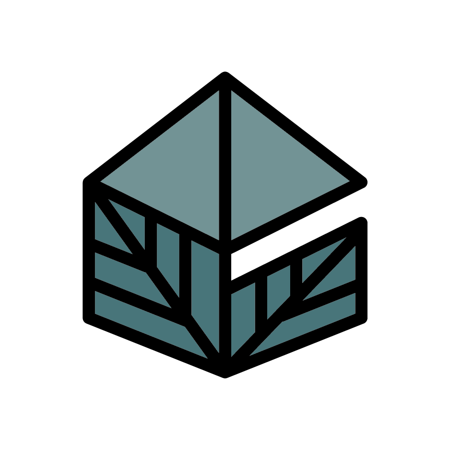
Starting with the line work, the angles and universal weight highlight the geometry and perfection that is a base in construction and home design. The merging lines literally show the bones of a house and how everything is connected – from the leaves grown on trees to the supporting plants in a home. Expanding to the whole of the shape, you are able to make out a 3D house–with the top triangles making the roof and the leaves standing for the walls. Focusing on design intent, there is a space between the roof and walls on the right side to hint at the letter “G” for Greencrafted Homes. When paired with the brand name, the “G” is really emphasized to capture the customers attention and interest.
The two-tone color fill is added to tie back to the parent brand’s color palette but also highlight the sub-brand’s mission. The darker leaves promote the energy efficiency/sustainability mission of the brand while grounding the entire logo mark. The lighter top triangles fill in the rest of the illustration to prove their finished homes are whole, sturdy, safe and beautiful.


The clean curves of Sweet Sans Pro provide a little bit of edge to the structured letters. The font pairs nicely with a clean, minimal logo by reemphasizing that simplicity. When comparing alongside the Paltrin word mark, the type is similar but not entirely to allow that differentiation between brands.

Our collaboration brought up important questions regarding mission and value that the team decided to take a step back and reevaluate. Through this shift, they still landed on one design but asked for alternate color options to later apply if it suited their new mission. I was happy to provide them the options they needed and sent them off with well wishes. Below are the alternate color palettes and early process work.

Round 1 options

Logo research and ideation
