3M™ UI Visual Brand Standards
When reviewing UI illustrations for a project update, there was a clear disconnect between all 3M product UI visual styles. This presented an opportunity to re-frame the style and standard of these graphics to give an overall 3M brand cohesiveness as well as a relationship between UI visuals and on-product visuals.
The short-term goal was to drive consistency across 3M’s Personal Safety Division but it now has a spot in 3M’s Corporate Brand Guidelines to drive the standard in all business groups and divisions.
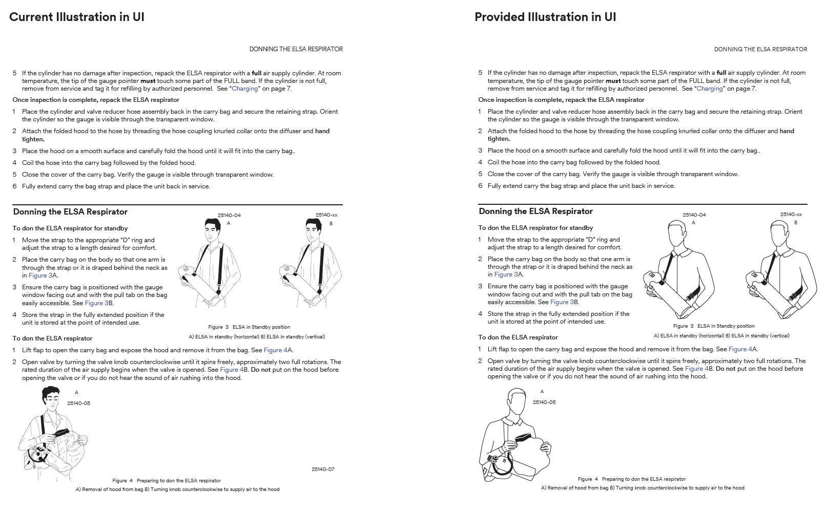
Below are various UI visuals that have a mixture of thick and thin lines, gender specific people, and filled in shapes.
To adhere to the new standard, the visual below is one example that shows how the change creates a clear and communicable instruction.


